Who Decides What Slot Symbols Look Like?
A slot symbol may take up only a small part of a phone screen. Yet it has a lot to do. It needs to fit the game’s theme, look distinct novinite.com from its neighbours, read clearly at a glance and feel satisfying when it lands. In a crowded casino lobby, it may also need to be recognisable at thumbnail size.
So who decides what slot symbols look like? Usually, no one person does. The art direction emerges through collaboration between a game studio’s art team, designers, animators, product specialists and, in some cases, external artists. A casino game illustrator may draw the first concepts, but those concepts are shaped by practical constraints: screen size, animation, game rules and the visual world the team wants to build.
That makes slot symbol design more than a matter of making attractive icons. It is the process of deciding what belongs in a game, how symbols should work together and what players should notice first. The best results can feel effortless. Behind that ease is a chain of small, deliberate choices.
It starts with a visual world, not a set of icons
Before an artist sketches a treasure chest, a citrus fruit or a glowing mask, the team needs a sense of the game’s world. Is it a sun-baked island, a theatrical city, a folklore-inspired forest or a playful underwater setting? What materials, colours and shapes belong there? How serious or whimsical should the tone feel?
These questions are part of theme development. The team may begin with a written brief, reference images, colour studies and rough sketches. Art direction then turns that broad idea into rules the rest of the work can follow. A game set in an old observatory, for instance, might use brass, deep blue and star-chart patterns. Those choices can guide the reels, background, interface, symbols and even the style of the button highlights.
That consistency matters. If a symbol looks like it came from a different game, it can weaken the sense of place. It can also make the screen harder to scan: visual details compete instead of helping players understand what they are seeing.
Building a symbol family
A set of slot symbols works a little like a cast of characters. Individual designs need to be distinctive, but they also need to feel as if they belong to the same production. A casino game illustrator might develop a shared approach to outlines, shading, texture and perspective, then adapt it for each object.
The process typically includes deciding which kinds of symbols the game needs, and how each group will differ. The exact structure varies by game, but teams often use visual hierarchy: some symbols are designed to attract more attention, while others need to be clear and easy to distinguish without dominating the screen.

That hierarchy can be expressed through colour, shape, scale and detail. A team might reserve a particular glow or frame treatment for special symbols, while keeping simpler icons quieter. The aim is not to make every symbol equally loud. It is to give each one a job.
Why mobile readability changes the artwork
Artwork that looks polished on a large monitor can become muddled when it is reduced to a small phone screen. Fine engravings disappear. Thin outlines break up. A complicated silhouette can turn into an indistinct patch of colour. This is why slot icon artwork has to be judged at the size players will actually see it.
Artists and designers often review symbols inside the game layout rather than in isolation. A design may look clear on a white artboard but lose its edges against a busy reel background. The team may adjust contrast, simplify small details or make an important feature larger. These are not just finishing touches. They can change whether a symbol is readable at all.
Silhouette comes first
A useful test is to reduce a symbol to a dark shape. Can you still tell it apart from the others? If two icons share a similar outline, changing their colours may not be enough—especially for players with colour-vision differences, or in a quick animation where the image is visible for only a moment.
Strong silhouettes give the eye another way to recognise a symbol. A crown, a key and a flower should not rely on colour alone to communicate their identity. Their outer shapes need to do some of the work.
Detail needs a purpose
Small details can make an object feel specific: a nick in a sword, a pattern on a shell, a few glints on a gem. But each extra mark has a cost. On mobile, too many tiny features can blur together, and unnecessary texture may distract from the shape of the icon.
That does not mean every symbol should be plain. It means details should support recognition or atmosphere. If a flourish disappears at phone size and adds no useful character, it may not need to be there.
From reel symbol to lobby thumbnail
Players may encounter a game before they ever see its reels. In a casino lobby, a small promotional image has to convey the game’s identity in a compact space. This creates a second readability challenge: the symbols and the wider art direction need to work both in play and as part of a thumbnail.
At thumbnail size, a game’s defining elements may be reduced to a title, a central character or object, and a handful of colour cues. Teams therefore need to decide which visual features are most recognisable. Is it the striped tiger, the red lantern, the turquoise sea? A clear focal point can help the artwork stand out without filling the image with competing details.
Thumbnail recognition does not mean every game must use the same formula. It means the visual identity should survive being scaled down. A distinctive outline or unusual colour pairing may do more than a pile of small decorative elements.
Animation: feedback, not just decoration
Movement gives symbols another role. An icon might pulse, rotate or briefly light up when something happens in the game. That animation can provide feedback: it helps show which symbol has changed, where attention should go or that a result has been registered.
Sound can reinforce that moment, but the visual cue should still make sense on its own. Some players play with sound off, in public, or while listening to something else. If the only clear indication that an event happened is a celebratory sound effect, an important piece of feedback has been left out.
Directing attention without overwhelming the screen
Animation is also a way to control attention. A brief highlight can guide the eye toward one part of a busy layout. But if everything flashes, bounces or glows at once, nothing has priority. The motion becomes noise.
Timing and restraint matter. A quick, purposeful movement can make a result easier to follow. Long or repeated effects may delay the next action or make it harder to focus on other information. Designers need to consider how an animation feels in context, not just how it looks in a preview.
There are accessibility considerations, too. Rapid flashing and intense motion can be uncomfortable for some players. Clear, readable feedback should not depend on fast movement alone. Static contrast, labels and simple changes in shape or position can help communicate what is happening.
Who has a say in the final design?
Roles differ between studios, but symbol design usually involves several perspectives. An artist creates and refines the visuals. An art director keeps the work consistent with the game’s world. A game designer checks that visual cues support the rules and flow. A user interface designer considers how symbols sit within the screen. An animator plans how they move. Developers help ensure the assets work in the finished product.
Product, marketing or publishing teams may also offer input, particularly on the game’s identity and presentation in a lobby. That does not mean a committee draws every icon. It means the artwork is reviewed against different needs before it is finalised.
Role Typical question What it can change Casino game illustrator Does the symbol feel distinctive and fit the theme? Shape, detail, colour and finish Art director Does the whole set belong to the same visual world? Style rules, palette and consistency Game designer Can players understand the symbol’s role? Visual hierarchy and clarity of cues UI designer Can the artwork be read in the actual layout? Scale, spacing, contrast and placement Animator and developer Can the symbol move and respond clearly in-game? Motion, timing and technical implementationThe final design is usually the result of iteration. A first sketch may be attractive but too detailed. A simplified version may read better but lose personality. The team tests alternatives, checks them in context and makes adjustments. The useful question is not only “Does this look good?” It is also “Can someone recognise it quickly, on a phone, against these other symbols?”
A practical review checklist
When reviewing slot symbol design, a studio can ask:
- Does the symbol fit the game’s theme and visual style?
- Is its silhouette distinct from the other icons?
- Does it remain clear at its smallest on-screen size?
- Can its meaning be understood without relying on colour alone?
- Does it stand out appropriately, without competing with everything else?
- Will its key features still be recognisable in a casino lobby thumbnail?
- Does any animation provide useful feedback, rather than motion for its own sake?
- Can players understand important changes with sound turned off?
These checks are not a recipe for one correct style. They are a way to catch problems before visual polish makes them harder to see.
So, who decides?
There is no single author of a finished slot symbol set. The illustrator may give the icons their character, but the broader team decides how that character fits the game, reads on a small screen, behaves in motion and holds up outside the reel view.
Good slot icon artwork balances personality with clarity. It belongs to a coherent world, but does not get lost in its decoration. It can attract attention without demanding it constantly. And when animation or sound adds feedback, the visual design still gives players enough information to follow what is happening.
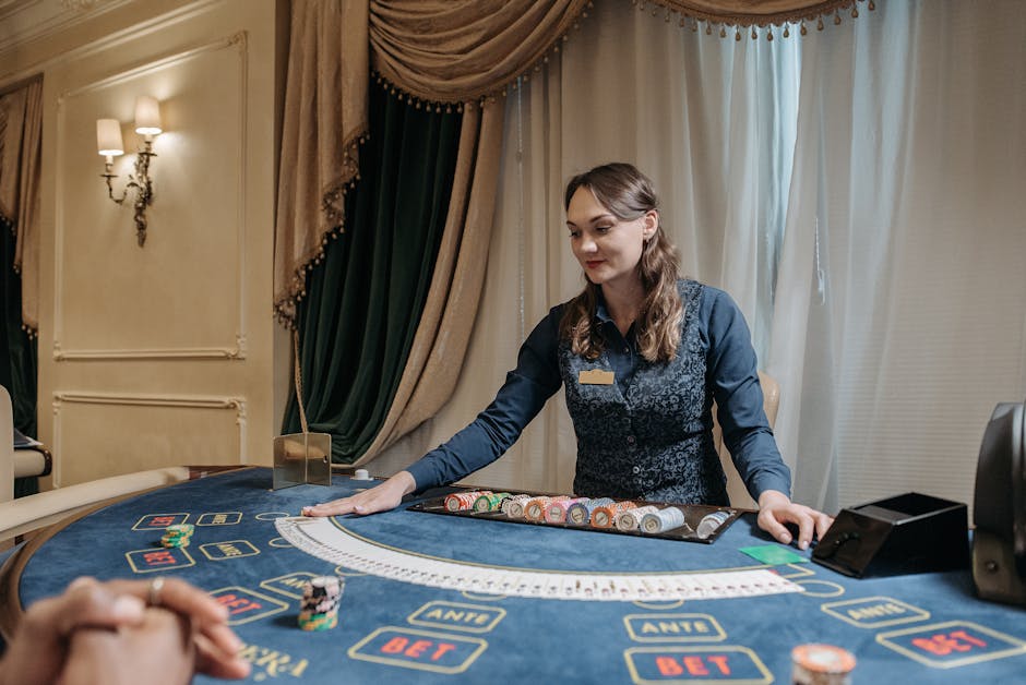
For image references and supporting visual research, teams may use libraries such as Unsplash. Photo credit: La Planque Du Joueur on Unsplash.